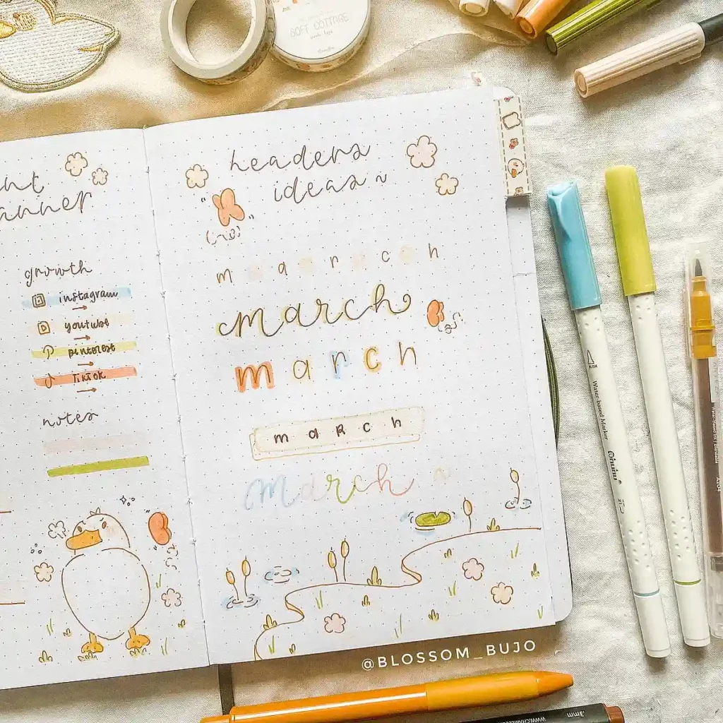
There’s something about starting a new month that just feels refreshing. A blank page, a fresh mindset, and the perfect excuse to try out a new March header ideas for your bullet journal design.
If you love journaling as much as I do, you know that the March bujo headers set the tone for your spreads. Whether you go for a minimal, colorful, or artistic style, your header is the first thing you see when you flip to the month’s page—so why not make it beautiful?
In this post, I’ve rounded up some of my favorite March header ideas to help you find the perfect style for your March journal.
From cute and playful to elegant and hand-lettered, there’s a little something for every aesthetic. Let’s make this month’s pages extra special!
Why a Good March Header Sets the Tone for Your Journal
A well-designed March header bujo page isn’t just about looks—it’s about setting the mood for the entire month. The way you style your March bullet journal ideas can make planning feel more exciting and keep you motivated to stick with your spreads.
Your header is like the cover of a book. A clean, minimal design can bring a sense of calm and focus, while a colorful or artistic layout adds energy and creativity.
No matter what style you go for, taking a little extra time on your March header aesthetic can make a big difference in how you interact with your journal.
Also, quick reminder: The images featured in this post come from some incredibly talented artists on Instagram. If you find a style you love, make sure to check out the original creator and give them some love! Supporting artists is just as important as finding inspiration for your own March journal ideas.
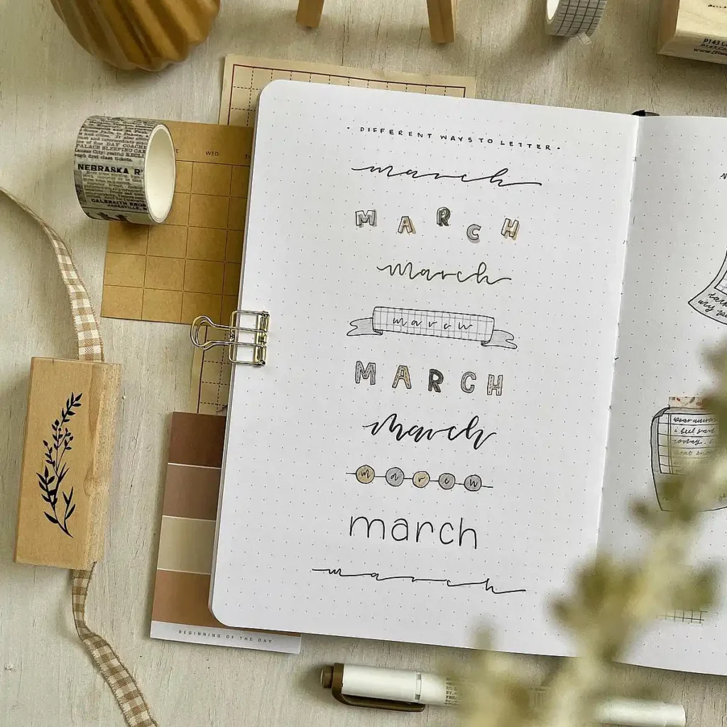
Essential Supplies for Beautiful March Bullet Journal Headers
You don’t need a massive collection of stationery to create stunning March bujo headers, but having a few go-to supplies can make the process so much easier.
- Fineliners & Brush Pens – A smooth black fineliner is a must for crisp outlines, while brush pens are perfect for elegant hand-lettered March headers. Popular picks: Micron, Tombow Fudenosuke, and Pentel Touch.
- Markers & Highlighters – Whether you’re going for a March colorful header or a soft pastel theme, highlighters and markers add dimension to your designs. Zebra Mildliners and Crayola Supertips are great for layering colors.
- Washi Tape & Stickers – If you’re short on time or not confident in your drawing skills, washi tape and stickers can add an instant decorative touch to your March journal without much effort.
- Pencil & Eraser – Sketching out your header first helps avoid mistakes, especially for March artistic headers that require more detail.
- Ruler & Stencils – A ruler keeps lines straight for March minimal headers, while stencils make it easy to create fun shapes and banners.
Even with just a few of these tools, you can experiment with different March header ideas and find a style that makes you excited to open your journal every day.
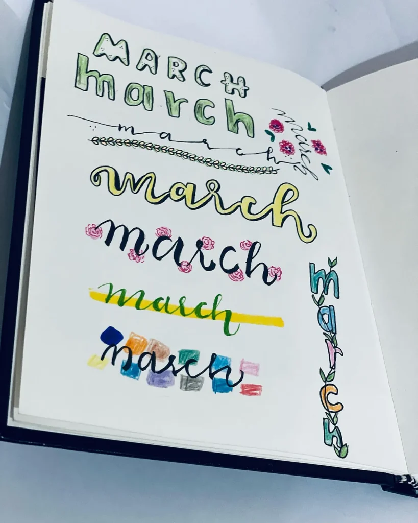
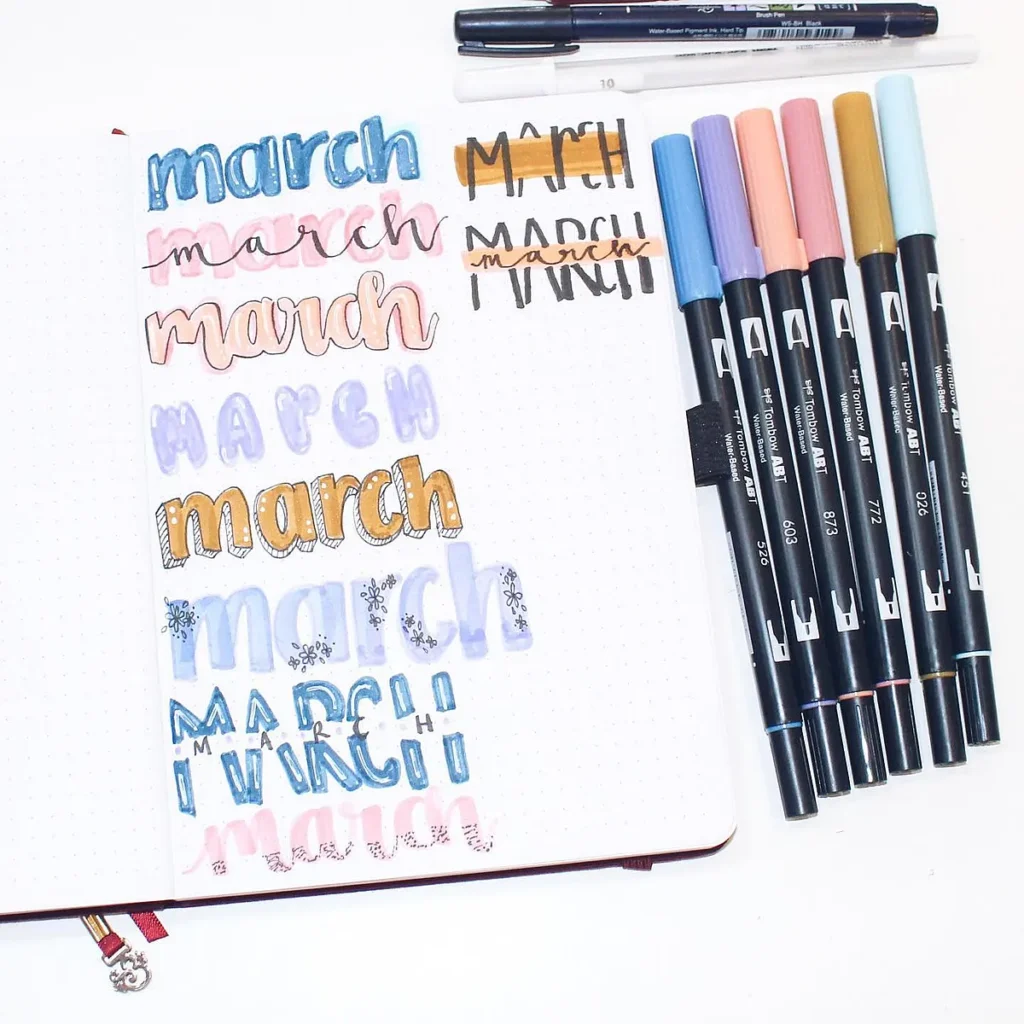
Colorful March Header Ideas for Your Bullet Journal
Your March header bullet journal design is the first thing you see when you open your monthly spread, so why not make it something you love?
Whether you want something bright and colorful, soft and minimal, or artistic and hand-lettered, there’s a style out there that fits your vibe.
Below are five creative March bujo headers to inspire your next spread. Each one brings a unique aesthetic, so you can mix, match, and make it your own!
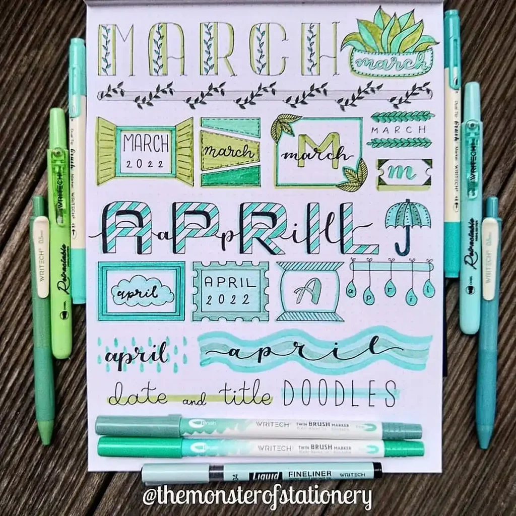
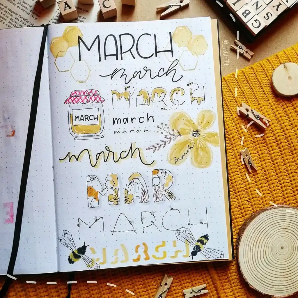
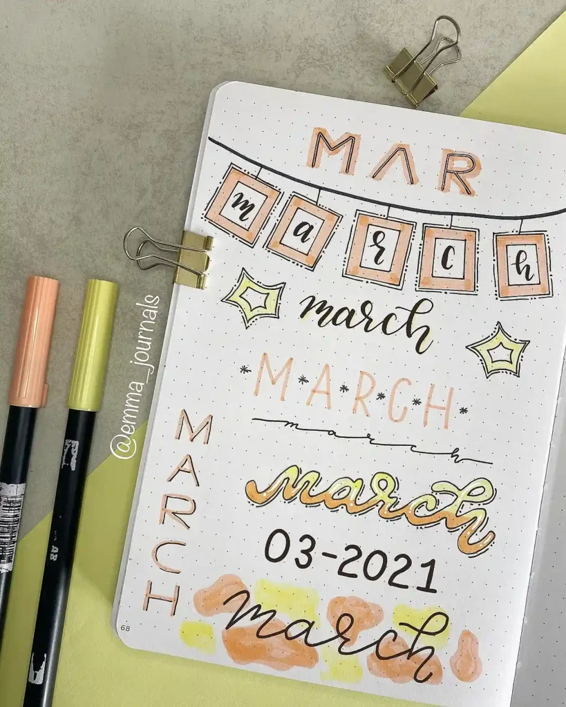
1. Honeycomb-Inspired March Headers
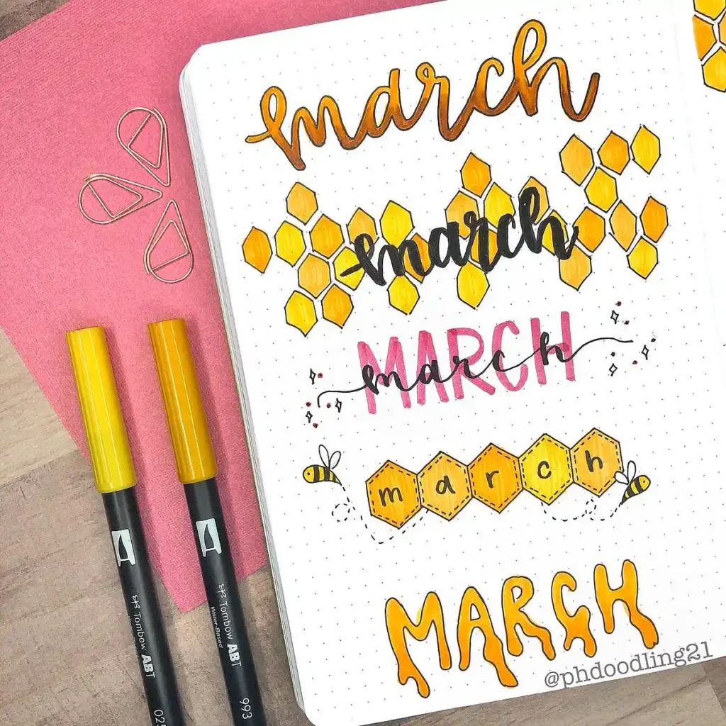
This set of March header aesthetic is too sweet to pass up! The honeycomb design adds such a warm, inviting feel, and the mix of lettering styles keeps things playful.
If you’re going for a March bullet journal idea with a cozy, nature-inspired theme, try layering different yellows for depth and adding tiny bee doodles for extra charm.
A pro tip? Use a light yellow base and then add shading with an orange or brown marker to make the honeycombs pop!
2. Whimsical & Nature-Inspired Headers
If you love a hand-drawn, organic feel, this set of March bujo headers is perfect. The leafy vines, tiny florals, and mix of bold and delicate fonts make it feel effortlessly charming.
This style is great if you want a March header bujo theme that’s soft and artistic without being overly structured.
Try experimenting with different green tones to bring more depth to the vines, and don’t be afraid to mix cursive with block lettering for contrast!
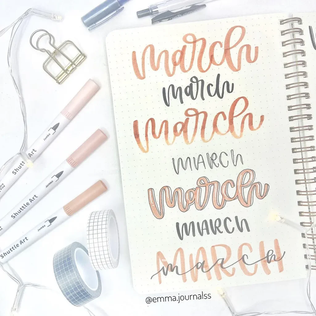
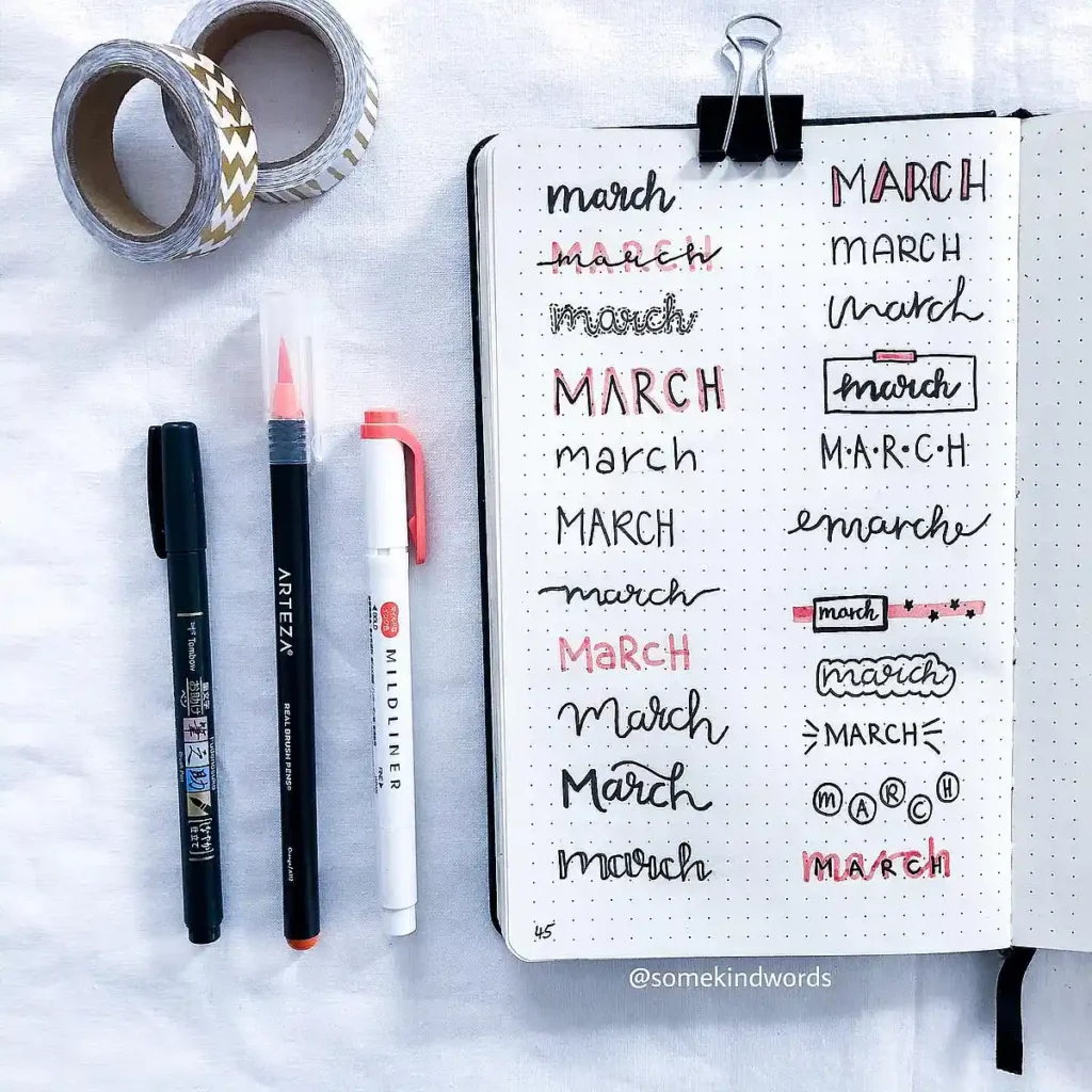
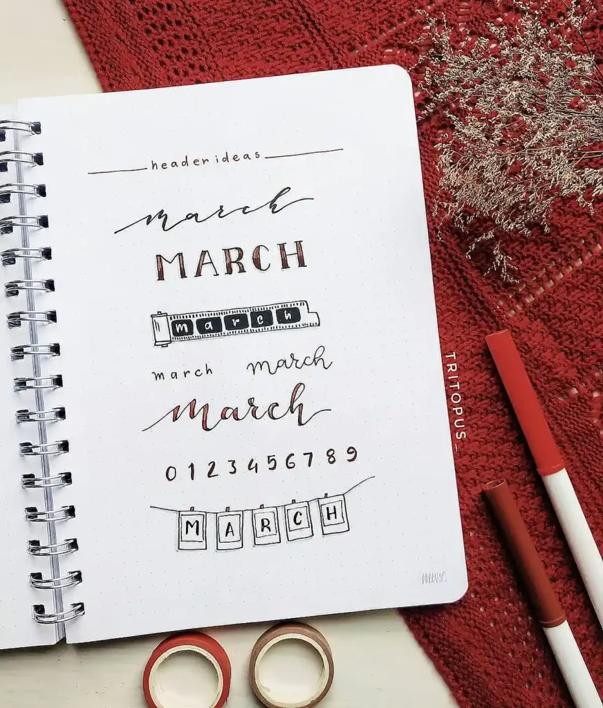
3. Versatile March Header Ideas
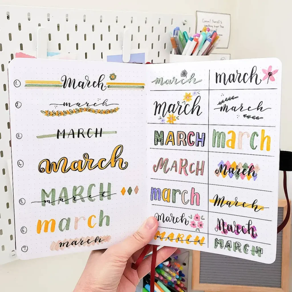
This collection is basically a mini mood board of March journal ideas—so many styles to choose from!
Whether you want simple and minimal or bold and decorative, there’s a little something for every vibe.
A great way to use this concept in your March header bullet journal is to sketch out a few variations before committing to your final design. That way, you can pick the one that fits your spread best.
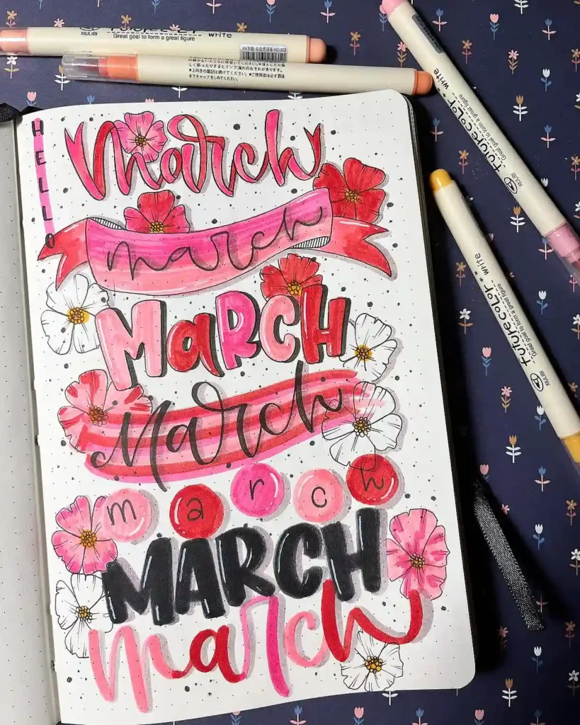
4. Bold Pink & Black Lettering
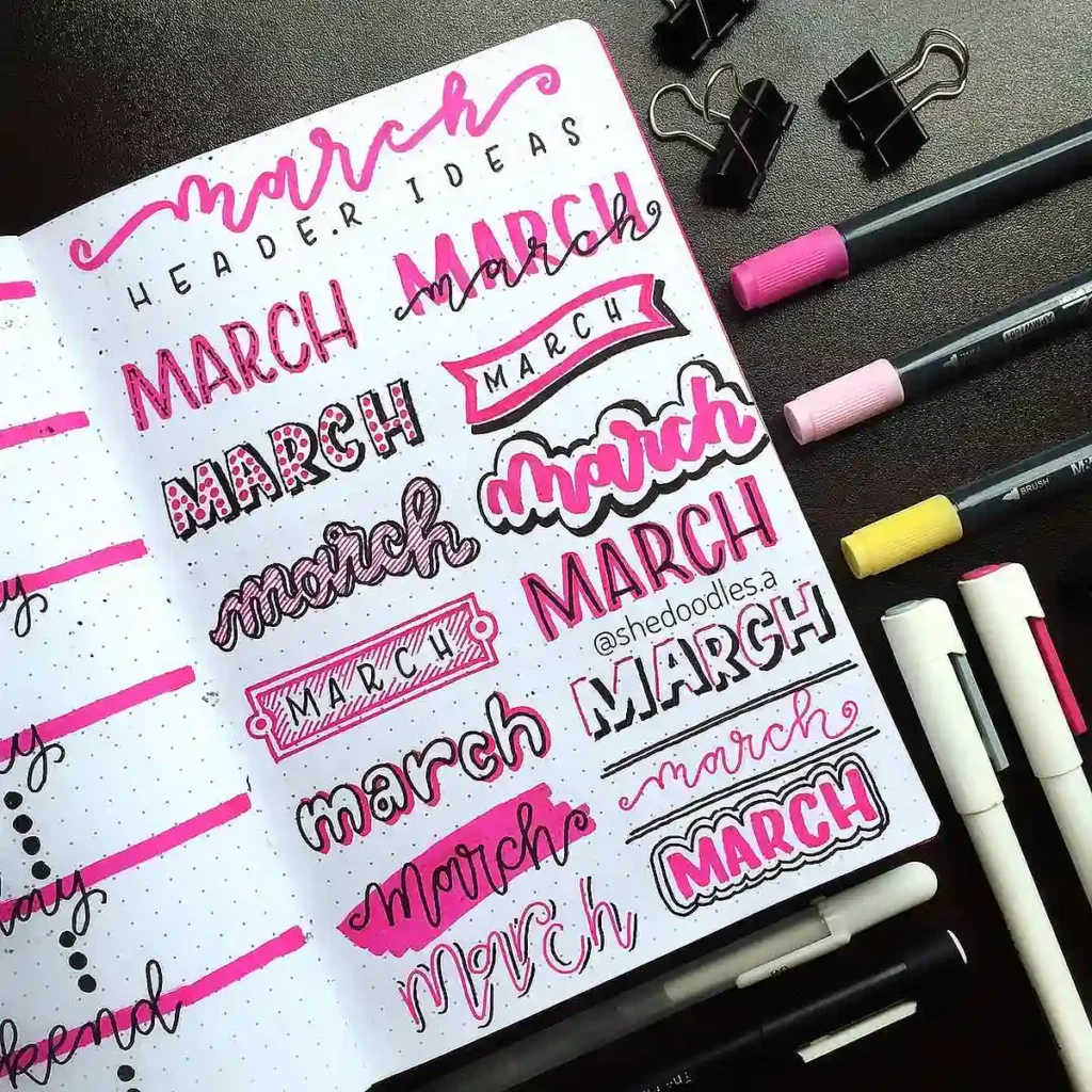
If you love bold, eye-catching fonts, this March bullet journal header spread is for you. The mix of pink and black creates such a striking contrast, making the words pop right off the page.
Outlining your letters with a darker shade (or even a white gel pen on darker colors) can help add extra dimension. If you’re aiming for a March header bujo theme with major personality, this high-energy color combo is a must-try!
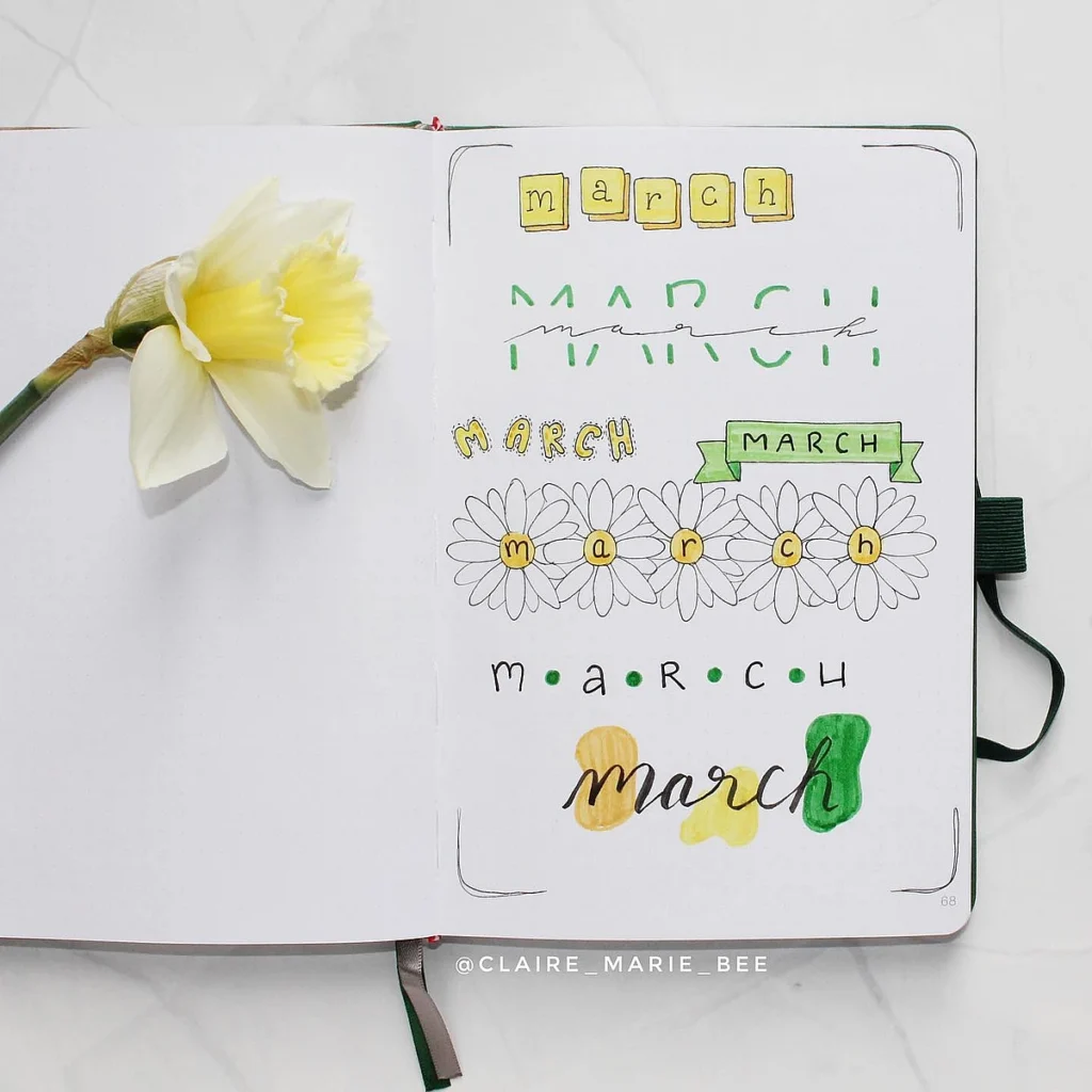
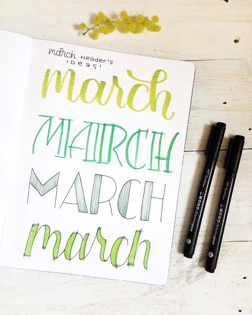
5. Green & Yellow Hand-Lettered Headers
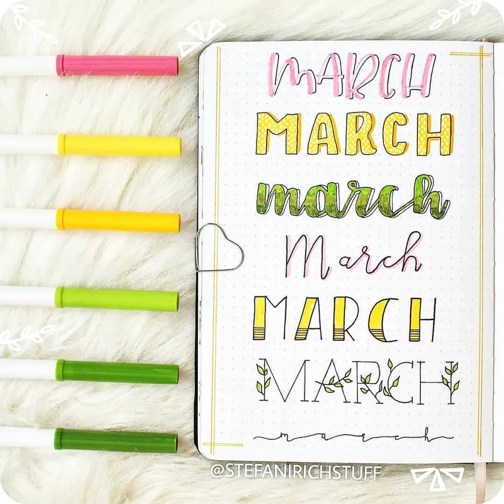
This set of March journal ideas feels so fresh and organic, with shades of green and yellow bringing in those early spring vibes.
The subtle patterns inside the letters add just the right amount of detail without making it feel too busy. If you’re looking for a March header bullet journal style that’s simple yet creative, try adding small leaf doodles or playing with different texturing techniques inside the letters.
6. Botanical & Vintage Ticket-Inspired Headers
Okay, but how cool is this concept? These March bujo headers mix delicate vines with a totally unique ticket-style lettering effect. It’s a fun twist if you want your March header bujo page to feel a little more vintage and artistic.
Using muted greens and blues keeps it soft, while the structured ticket shapes add a bold graphic element. If you want to try this, sketch the ticket outlines first with a pencil, then layer your colors to create depth!
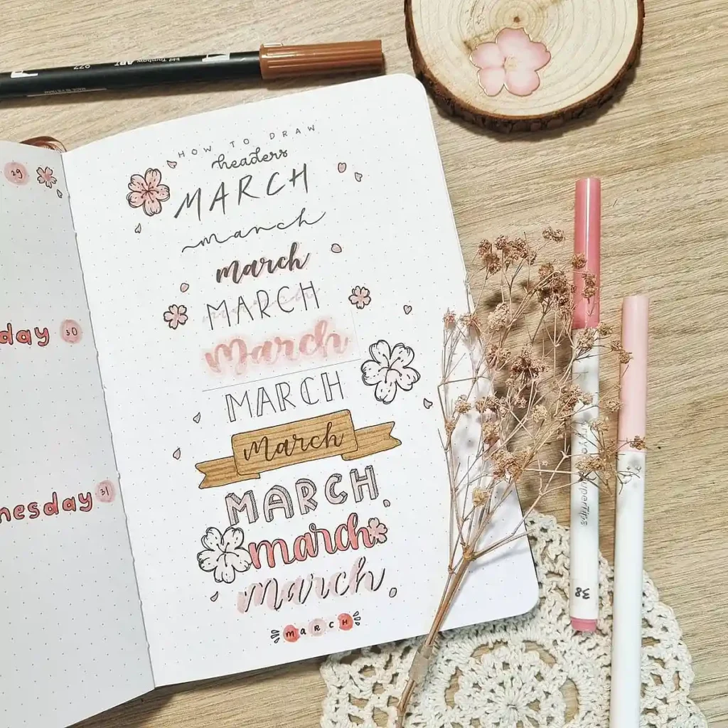
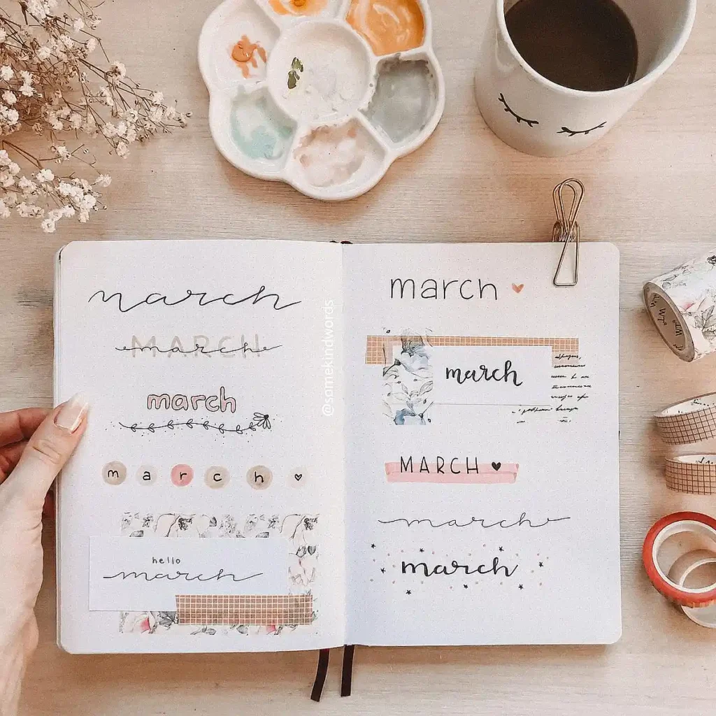
7. Floral & Pastel “Hello March” Headers
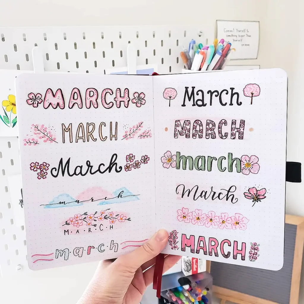
Soft, delicate, and straight-up gorgeous! This March header aesthetic is a dream for anyone who loves florals and soft pastels.
The tiny cherry blossoms and watercolor elements give the headers an airy feel, making them perfect for a spring-inspired March bullet journal idea.
If you want to recreate this look, try using a light pink base and gently blending with a watercolor brush pen. Small flower doodles instantly add a feminine touch!
March Cute Headers
If you love a touch of adorable in your journal, these cute March header ideas are for you! Playful fonts, soft colors, and charming doodles can make your pages feel extra inviting.
6. Cozy & Vintage-Inspired Details
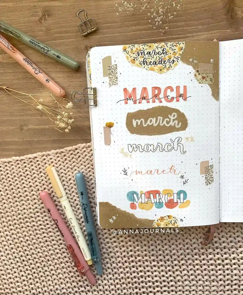
This spread gives major cozy vibes with its earthy tones and scrapbook-style elements. The torn paper, muted colors, and delicate floral details make it feel effortlessly warm.
If you want to recreate this look, try layering different shades of brown and beige, then add some washi tape or pressed flowers for a textured effect.
7. Nature-Inspired Green & Orange Tones
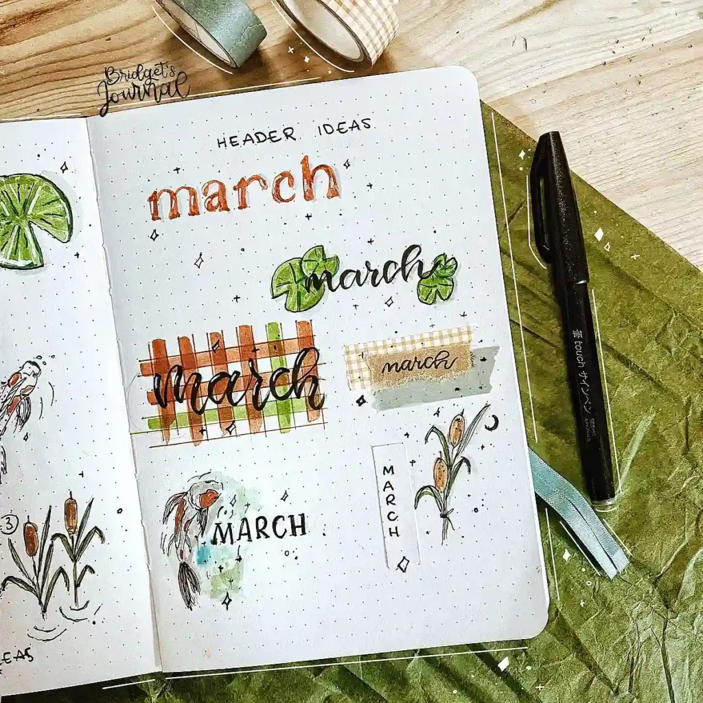
This one feels like a walk through a peaceful garden. The mix of watercolor-style illustrations and warm, natural colors makes each header feel so organic.
The little koi fish and cattails add a unique touch, perfect if you’re going for a soft, hand-drawn aesthetic.
Try using a light watercolor wash before adding details to give your page a more artistic feel!
8. Fresh & Floral Spring Aesthetic
If spring had a font, it would be this! The soft yellows and greens, daisy accents, and playful text styles make this an instant mood booster. A simple trick to achieve this look?
Use a thin black fineliner to outline flowers and leaves, then fill them in with gentle pastel tones for that fresh, airy vibe.
9. Soft Pink & Handwritten Charm
This spread is giving sweet, romantic, and effortlessly cute! The mix of script fonts, wooden sign details, and pink florals creates such a dreamy look.
If you want to try something similar, use a blush-colored highlighter for a soft background effect and layer with black or brown ink for that cozy, rustic feel.
10. Playful & Colorful Lettering
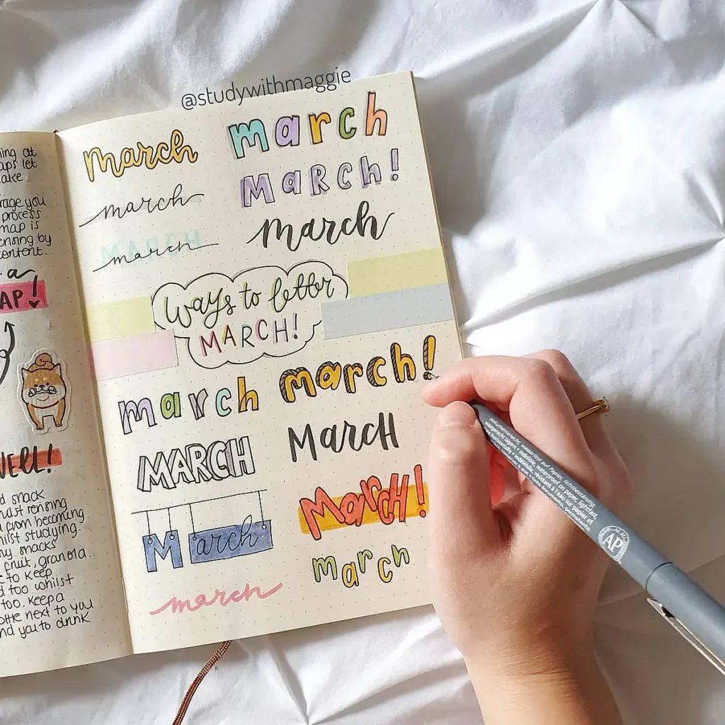
If you love variety, this page is packed with fun lettering styles. From bubbly fonts to simple handwritten text, this spread shows just how much you can mix and match!
A great way to experiment is to sketch a few different fonts in pencil first and then decide which style fits your theme best.
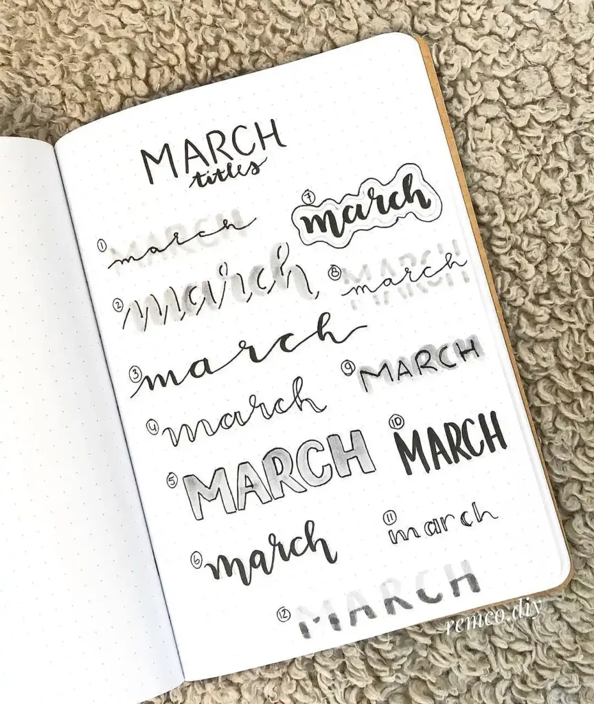
March Hand-Lettered Headers
If you’re obsessed with beautiful lettering, this section is for you.
Hand-lettered headers add a personal, artistic touch to your bullet journal, making your March pages feel even more special.
11. Bold and Vibrant Lettering
This header set brings so much energy with its bright orange and pink tones. The playful mix of cursive, block letters, and fine-line typography makes each style stand out.
If you want to recreate this look, try using dual brush pens to get those smooth gradient effects, and don’t be afraid to add a few ink splatters for an extra pop of personality.
12. Warm and Elegant Brush Lettering
Soft peach tones and smooth brush strokes make this set feel so delicate and refined. The gradient effect in the letters adds depth, creating a polished, professional look.
To achieve this, use a light base color first, then layer a slightly darker shade on top, blending the edges with a brush tip for that seamless fade.
13. Classic Green Calligraphy
Green is such a refreshing choice for March, and this set of headers balances elegance with a bit of fun.
The mix of script, bold lettering, and outlined text keeps it interesting while still looking cohesive. If you’re trying this style, use a fine-liner for outlining letters before filling them in with color to keep everything crisp and clean.
14. Playful Floral Hand Lettering
This one is pure springtime magic! The soft pinks, warm oranges, and delicate floral doodles create a dreamy, hand-drawn effect.
The variety of script styles adds movement to the page, making it feel effortless yet polished. Try using metallic gel pens or glitter accents to bring even more life to your lettering.
15. Fresh Green Botanical Style
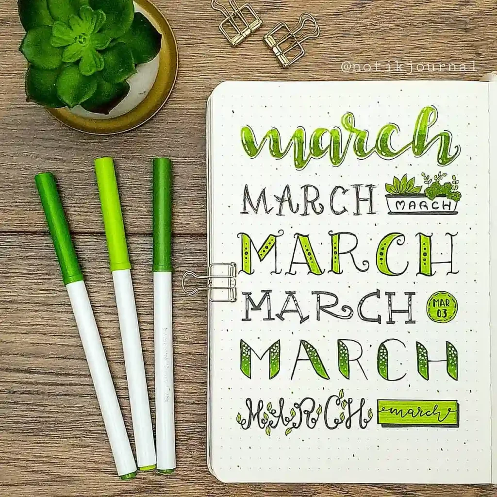
If you love a nature-inspired aesthetic, this one is for you. The leafy elements woven into the letters make the headers feel organic and fun, perfect for a fresh spring vibe.
Adding tiny plant doodles or vines around your text can instantly make your lettering feel more dynamic and full of life.
16. Simple and Modern Black & Red Lettering
Sometimes, less is more. This spread proves that simple black and red ink can make a striking impact.
The mix of thin and thick strokes adds a sleek, modern feel, making it a great option if you want something stylish but easy to replicate. Try using a fine-tip pen for the details and a brush pen for the thicker strokes to keep the contrast sharp.
17. Gradient and Shadow Effects
This set plays with depth and color in such a fun way. The layering of soft pastels with darker accents creates a bold, dimensional look.
If you want to try this technique, use a light-colored highlighter as a base, then outline with a darker shade to create a shadow effect that makes the letters pop.
March Minimal Headers
Sometimes, less is more. Minimal headers are perfect if you love a clean, effortless look that keeps your journal pages feeling light and uncluttered.
18. Scrapbook-Style Simplicity
If you love a mix of minimal and vintage, this spread is for you. The subtle washi tape details and soft script fonts give it an effortless, timeless feel.
To recreate this style, tear small pieces of neutral-colored paper and layer them behind your lettering for a cozy, scrapbook-inspired effect.
19. Soft Neutrals with Delicate Details
This spread is the definition of calm and cozy. The soft beige and warm brown tones create a gentle aesthetic, while the fine-line lettering keeps it feeling minimal.
If you want to achieve this look, stick to earthy colors and thin, delicate strokes to keep everything feeling light and airy.
20. Playful Yet Simple Doodles
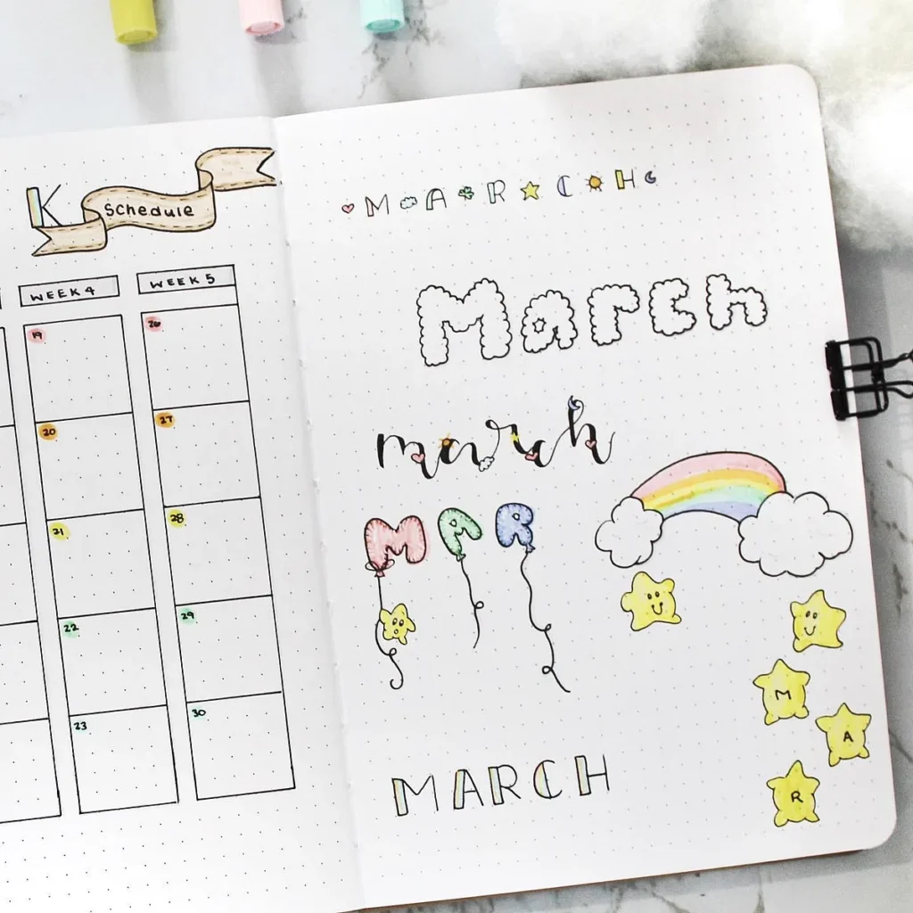
Minimal doesn’t have to mean boring, and this page proves it. The cloud-like bubble letters, balloon-inspired fonts, and tiny stars bring just the right amount of fun without overcomplicating the layout.
A great tip for keeping things balanced is to use one or two doodles per header so the design still feels clean and uncluttered.
21. Soft Taupe March Headers
This set is all about effortless elegance. The neutral color palette combined with small, delicate banners makes it feel polished yet minimal.
If you love the soft, sophisticated vibe, try using a muted gold or beige highlighter as a background for your lettering.
22. Classic Black and Gray Lettering
Nothing says chic and minimal like black ink on white paper. The different shades of gray used in this set create a subtle contrast that keeps it interesting without overwhelming the page.
Try layering light gray brush strokes behind your text to add depth while still keeping it simple.
23. Tiny Floral and Line Art Elements
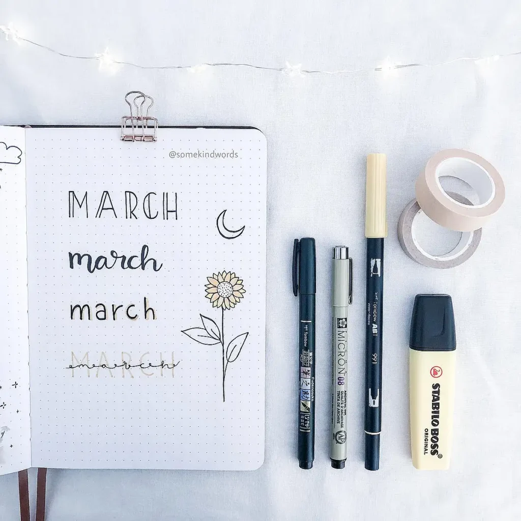
Minimal headers don’t have to be just about the font—adding tiny line art illustrations can make them even more special.
The thin sunflower doodle in this spread is a perfect example of how a single delicate drawing can elevate the entire design. A fine-tip black pen is essential for achieving this level of detail.
24. Classic Monochrome with a Bold Touch
This set takes a simple but striking approach with deep red and black ink. The mix of elegant script, bold serif fonts, and film-strip lettering adds variety while keeping the aesthetic minimal.
If you want to try this look, use a black brush pen for bold strokes and a fine-liner for the delicate script details.
25. Subtle Gray Washes and Calligraphy
This page is all about soft shadows and contrast.
If you’re into this style, try using a light gray or muted blue brush pen to add a shadow effect without overpowering your page.
March Artistic Headers
If you love getting creative with your bullet journal, these artistic headers are full of fun textures, bold designs, and eye-catching elements.
From watercolor effects to detailed illustrations, these ideas will inspire you to turn your March pages into a mini masterpiece.
26. Honeycomb and Floral Accents
The balance of bold uppercase lettering with soft, flowing calligraphy keeps it visually interesting. If you want to try something similar, use a fine-tip pen for detailing and a watercolor brush for soft shading to add dimension.
27. Playful and Colorful Lettering
This page is bursting with personality! The mix of bubble letters, soft watercolor effects, and pastel details creates a fun and lighthearted vibe.
A great way to make your own version is to experiment with different fonts and add simple doodles like rainbows or decorative borders to bring everything together.
28. Hanging Banner and Festive Elements
This one has such a cheerful, handmade feel! The small banner letters, playful typography, and decorative accents make it look like a celebration on the page.
To recreate this, use a ruler for clean banner lines and a thin marker for details, then add soft shading to make the elements pop.
29. Bold Red and Floral Theme
If you want your March header to stand out, this vibrant red and pink floral design is perfect. The deep hues contrast beautifully with the white page, while the brush lettering and floral doodles add a delicate touch.
Try layering different shades of red and pink with a brush pen to achieve a similar bold effect.
30. Elegant Ribbon and Mixed Fonts
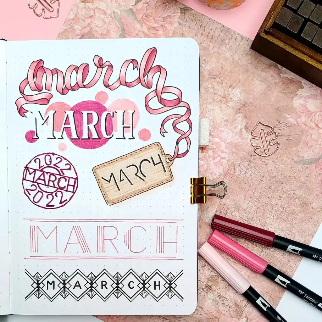
This spread combines ribbon-like script, structured typography, and 3D elements to create a truly artistic look.
The vintage tag and geometric designs add a scrapbook feel that’s both creative and polished. If you’re inspired by this style, use a fine-liner for precise lettering and add shadowing for a dimensional effect.
More March Journal Ideas to Elevate Your Layouts
Your header is just the beginning! Once you’ve chosen a design you love, why not carry the theme throughout your March bullet journal? From decorative spreads to functional pages, these ideas will help you tie everything together and keep your journal both beautiful and practical.
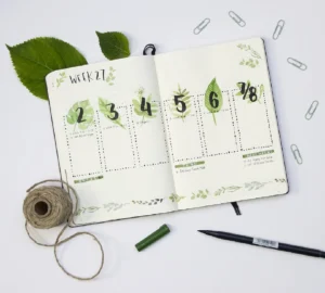
Themed Weekly Spreads
Match your March bujo headers with coordinating weekly layouts. If you went with a floral or pastel header, try adding soft watercolor accents to your weekly spreads.
If your header has bold lettering and graphic elements, keep that same high-energy style in your task lists and calendar pages.
Mood and Habit Trackers
Aesthetic meets functionality! Design a mood tracker that complements your March header bujo style—think flower petals, raindrops, or honeycombs that you can color in each day.
A habit tracker can be as simple as a minimalist grid or as creative as tiny doodles representing each habit.
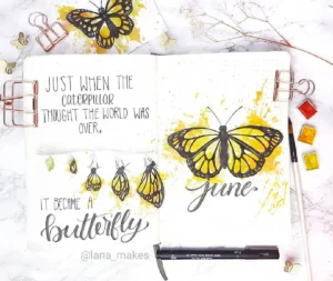
Seasonal Doodles and Decorations
Bring a little springtime magic into your journal! Add butterflies, clovers, cherry blossoms, or raindrops around your spreads to match the fresh start of March.
Even small decorative elements can make your journal feel more personal and inspiring.
Quote Page or Monthly Intentions
A beautifully lettered Hello March page with a motivational quote can set the tone for the month.
No matter how you design your March bullet journal, adding these small touches can make your pages feel thoughtful, cohesive, and uniquely yours.
Your March bullet journal header sets the vibe for the entire month, so make it something you love!
Keep it simple with clean lines and soft neutrals, or go bold with watercolor effects and playful doodles. Don’t forget to match your header with themed weekly spreads, trackers, and seasonal decorations to make your journal feel cohesive.
At the end of the day, your journal is yours, so experiment with different styles and find what makes you excited to open it every day!